Designing a chair using flat stock materials and manufacturing processes.
Sketches
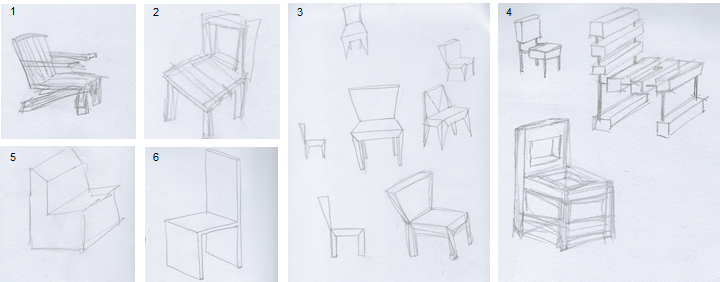
We were encouraged to jump right into model building (the module is called Making as Thinking). However, I had a lot of ideas floating around in my head so I sketched them in small vignettes. I find when starting to write or any creative process, brainstorming a variety of ideas and getting them on paper helps me sift through the ideas and focus on what interests me the most.
Model Making
I was initially going to proceed with a standard Adirondack chair (figure 1) as a way to explore assembly of flat materials. But once I got this and other ideas down, I moved onto card models as a way to explore more ideas.
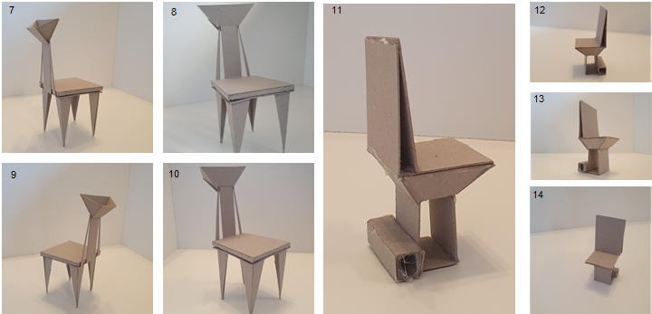
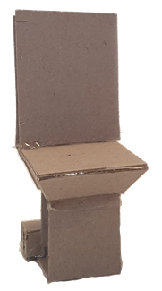
I started with the model shown in images 7-10, I was going for an art deco feel and wanted to explore the linear shapes of art deco design. There is a section at the back of the chair which was intended for a small handbag, or hat and gloves to be placed in. Unfortunately, even at and model stage I found that if weight was put into the back the chair would tip over – not particularly user friendly. This issue of balance could be mitigated by using alternative materials in the base / seat to make it heavier, or by looking again at the leg design. However, these alternatives risk the aesthetic element.
Because tipping was an issue with my first model, I wanted to make something sturdier for the next chair. I created the model shown in images 12-14, which were influenced by sketches 3 and 4. I wanted to keep the flat aesthetic but slightly tilt the back to make it more ergonomic than a 90-degree angle. After completion and reflection, I can imagine this being made in concrete or another hard weather material and used as a park chair (with chess tables for example).

Laser Cutter

I have never used a laser machine before, and after being shown its capabilities I was particularly interested in its ‘etching’ abilities. I decided on a simple chair design to celebrate the aesthetic of this functionality. It is not designed as an ergonomic piece as the back would be uncomfortable and you are unable to naturally put your feet underneath while seating. I envision it more of an exhibition piece. The ‘etching’ didn’t make a noticeable textural change to the card, it was more of a ‘burn’. The cutting also created this burn effect which was particularly interesting on the bottom side of the card where a watercolour type effect was created. I used a fragmented butterfly to represent the delicate state of our environment, but the possibility of change usually represented by using a butterfly as a symbol.
